


Photo by Susan Q Yin on Unsplash
Building a custom sheet in SwiftUI
Implement a useful UI component that can be found in any app


Table of contents
Intro
Once I started using SwiftUI for the projects I work on, my life has become easier. I encourage people to try this framework and build beautiful iOS apps with its power.
However, sometimes the simplicity that SwiftUI offers doesn't fit needs of a developer as certain customizations are not possible and workarounds come into play.
Today I want to share what I ended up using in my projects whenever I want the app to show a modal screen aka sheet.
Idea
Imagine we work on a e-commerce app which allows to order items online. We develop a feature that lets users view the list of items, select the desired one and purchase it.
Initially, the user starts their journey on Catalog screen which contains a list of items available online for orders. When the customer wants to buy an item they can select it by tapping and observe another modal screen appearing with an interface to complete the purchase.
Note: The modal screen here called a sheet.
Setup
First, let's define a model that represents an item from the catalog in our app.
struct CatalogItem: Identifiable {
    let id = UUID()
    let title: String
    let imageName: String
    let price: Int
}
Next, populate items array with the data that reflects the range of goods in our store.
let items = [
    CatalogItem(title: "Phone", imageName: "phone", price: 1000),
    CatalogItem(title: "Lamp", imageName: "lamp", price: 100),
    CatalogItem(title: "Keyboard", imageName: "keyboard", price: 300),
    CatalogItem(title: "Chair", imageName: "chair", price: 700),
    CatalogItem(title: "Book", imageName: "book", price: 100),
]
We're now ready to show items to our users. Let's start with CatalogItemView which represents a single item from the catalog:
struct CatalogItemView: View {
    let item: CatalogItem
    var body: some View {
        ZStack {
            Color.purple
            HStack {
                Spacer().frame(width: 30)
                Image(item.imageName)
                    .resizable()
                    .aspectRatio(contentMode: .fill)
                    .frame(width: 100)
                    .cornerRadius(10)
                    .clipped()
                    .shadow(color: .black.opacity(0.25), radius: 5, x: 4, y: 4)
                    .padding(.vertical, 5)
                Spacer()
                VStack(alignment: .center, spacing: 10) {
                    Text(item.title)
                        .font(.title)
                        .foregroundColor(.white)
                    Text("Price: $\(item.price)")
                        .foregroundColor(.white)
                }
                Spacer()
            }
            .frame(maxWidth: .infinity)
            .padding(.vertical, 5)
        }
        .cornerRadius(20)
        .frame(height: 120)
    }
}
We've done a bunch of customizations using ViewModifiers like .shadow(), feel free to read up on Apple docs in case you're interested.
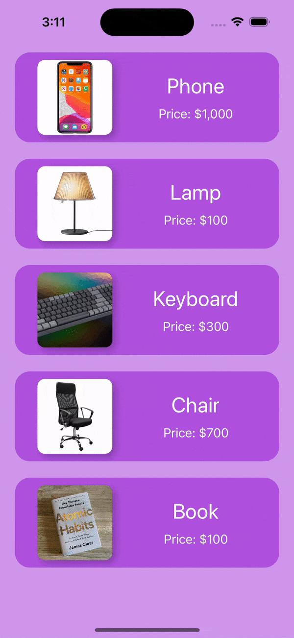
Here's what we've got so far:

It already looks pretty sharp to me, but let's not stop and present the whole list of items we have in the store. Define CatalogView as follows:
struct CatalogView: View {
    let items: [CatalogItem]
    var body: some View {
        ZStack {
            Color.purple.opacity(0.6)
                .edgesIgnoringSafeArea(.all)
            List {
                ForEach(items) { item in
                    CatalogItemView(item: item)
                        .listRowBackground(Color.clear)
                        .listRowSeparator(.hidden)
                }
            }
            .listStyle(.plain)
            .scrollContentBackground(.hidden)
        }
    }
}
If we run the app with all the code, we'll get the following screen:
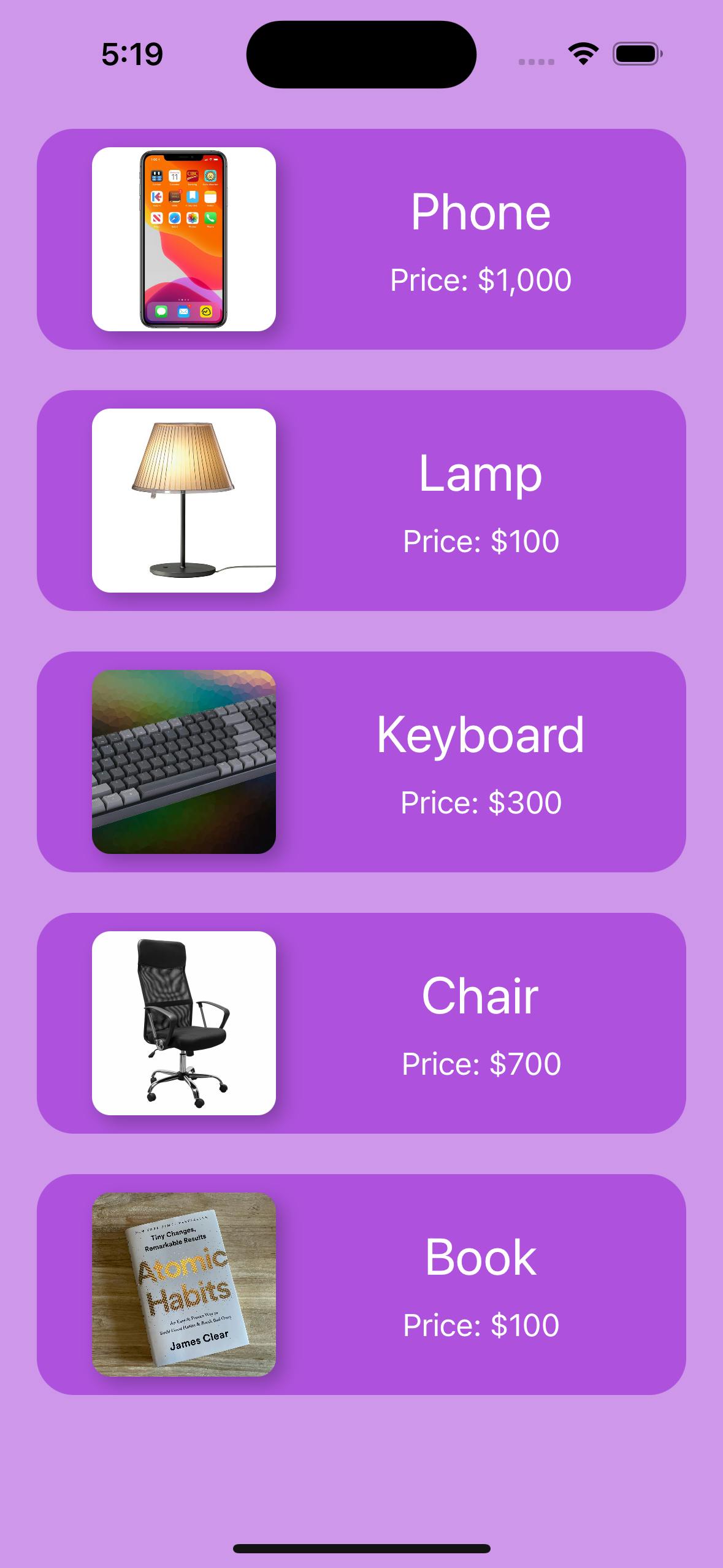
Now once we have the foundation of our app idea we can delve into specifics of the article: sheets
Sheet
By design when a user taps an item from the catalog, a sheet is presented to complete purchase.
Hence, we first need to implement the view that will represent the selected item: ItemDetailView
struct ItemDetailView: View {
    let item: CatalogItem
    var body: some View {
        ZStack {
            Color.purple
                .edgesIgnoringSafeArea(.all)
            VStack(spacing: 25) {
                Image(item.imageName)
                    .resizable()
                    .aspectRatio(contentMode: .fill)
                    .frame(width: 300, height: 300)
                    .cornerRadius(20)
                    .clipped()
                    .shadow(color: .black.opacity(0.25), radius: 5, x: 4, y: 4)
                Text(item.title)
                    .font(.system(size: 40, weight: .bold))
                    .foregroundColor(.white)
                Text("Price: $\(item.price)")
                    .font(.system(size: 30))
                    .foregroundColor(.white)
                Spacer().frame(height: 40)
                Button {
                    print("Purchase button is clicked.")
                } label: {
                    Text("Purchase")
                        .font(.system(size: 24, weight: .medium))
                        .foregroundColor(.purple)
                        .frame(width: 220, height: 65)
                        .background(.white)
                        .cornerRadius(20)
                }
            }
        }
    }
}
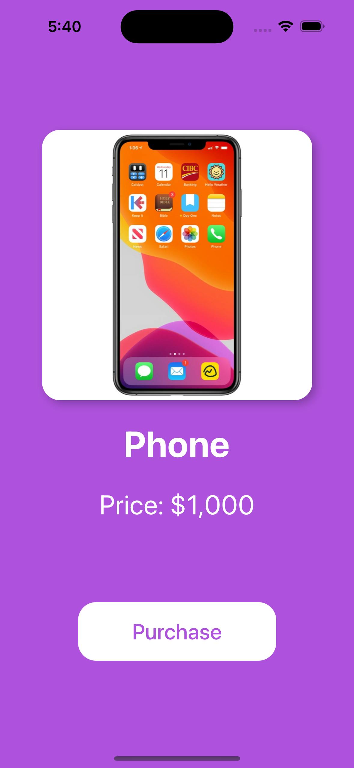
The code above generates a view representation like this:
Note: Instead of the print() statement in production the button action should actually send a request to initiate the purchase.
The Traditional Way
Now we need to implement the logic to present ItemDetailView modally when the user selects the item from the CatalogView.
SwiftUI framework provides a standard mechanism using sheet() modal presentation.
See Also: Apple Docs
To make use of sheet() in our example we need to slightly change CatalogView:
struct CatalogView: View {
    @State var selectedItem: CatalogItem?
    let items: [CatalogItem]
    var body: some View {
        let showDetail = Binding {
            self.selectedItem != nil
        } set: {
            if !$0 { self.selectedItem = nil }
        }
        ZStack {
            Color.purple.opacity(0.6)
                .edgesIgnoringSafeArea(.all)
            List {
                ForEach(items) { item in
                    CatalogItemView(item: item)
                        .listRowBackground(Color.clear)
                        .listRowSeparator(.hidden)
                        .onTapGesture {
                            selectedItem = item
                        }
                }
            }
            .listStyle(.plain)
            .scrollContentBackground(.hidden)
        }
        .sheet(isPresented: showDetail) {
            ItemDetailView(item: selectedItem!)
        }
    }
}
Here is how it looks like:
In short, we add the @State var selectedItem property which is set when the user taps one of the items in the list. The showDetail binding is used here to transform Optional<CatalogItem> binding to a boolean one that can be passed to sheet() to track whether the sheet needs to be presented.
While this approach doesn't require a lot of changes and for the most part works out of the box, it has certain limitations that makes it hard rather than easy to develop a complex app with multiple states.
Because of this, I built a practice to implement and present custom sheets in my apps which I'm going to share with you in a second.
A Better Way
In this approach we need to change a bit both CatalogView and ItemDetailView, however it gives more freedom for customizations.
struct CatalogView: View {
    @State var selectedItem: CatalogItem?
    let items: [CatalogItem]
    var body: some View {
        let showDetail = Binding {
            self.selectedItem != nil
        } set: {
            if !$0 { self.selectedItem = nil }
        }
        ZStack {
            ZStack {
                Color.purple.opacity(0.6)
                    .edgesIgnoringSafeArea(.all)
                List {
                    ForEach(items) { item in
                        CatalogItemView(item: item)
                            .listRowBackground(Color.clear)
                            .listRowSeparator(.hidden)
                            .onTapGesture {
                                withAnimation {
                                    selectedItem = item
                                }
                            }
                    }
                }
                .listStyle(.plain)
                .scrollContentBackground(.hidden)
            }
            if let selectedItem = selectedItem {
                ItemDetailView(item: selectedItem, isPresented: showDetail)
                    .transition(.move(edge: .bottom))
            }
        }
    }
}
struct ItemDetailView: View {
    let item: CatalogItem
    @Binding var isPresented: Bool
    init(item: CatalogItem, isPresented: Binding<Bool>) {
        self.item = item
        self._isPresented = isPresented
    }
    var body: some View {
        ZStack {
            Color.purple
                .edgesIgnoringSafeArea(.all)
            VStack(spacing: 25) {
                Image(item.imageName)
                    .resizable()
                    .aspectRatio(contentMode: .fill)
                    .frame(width: 300, height: 300)
                    .cornerRadius(20)
                    .clipped()
                    .shadow(color: .black.opacity(0.25), radius: 5, x: 4, y: 4)
                Text(item.title)
                    .font(.system(size: 40, weight: .bold))
                    .foregroundColor(.white)
                Text("Price: $\(item.price)")
                    .font(.system(size: 30))
                    .foregroundColor(.white)
                Spacer().frame(height: 40)
                Button {
                    print("Purchase button is clicked.")
                } label: {
                    Text("Purchase")
                        .font(.system(size: 24, weight: .medium))
                        .foregroundColor(.purple)
                        .frame(width: 220, height: 65)
                        .background(.white)
                        .cornerRadius(20)
                }
            }
        }
    }
}
Result:

When implementing the sheet interface in this style we leverage the power of ZStack in composition with transition animations.
Note: I've previously posted an article on transition animations in SwiftUI, read up in case you're interested.
The ItemDetailView is shown conditionally only if selectedItem is not niland ZStack puts it on top covering the CatalogView. This creates a perception that the detail view behaves like a sheet view.
Moreover, we add a close button that dismisses the detail view when the user wants. Now even if you develop a complex app you won't likely face the problem of app states not being in sync as it sometimes can be when using default sheet() mechanism.
Wrap Up
Hope you will find the article useful and apply the pattern I discovered and use in my projects for your own needs in your projects.
Use sheet() method to present modal screens when its usage is justified, however consider implementing your own sheets as suggested in the article if you want to have a stable UI as part of the complex app.
I'm open to feedback, so please start a discussion in comments if you have suggestions!